
Featured in HOW'S International Design Annual 2009 and GD USA's American Graphic Design Awards 2008
Design
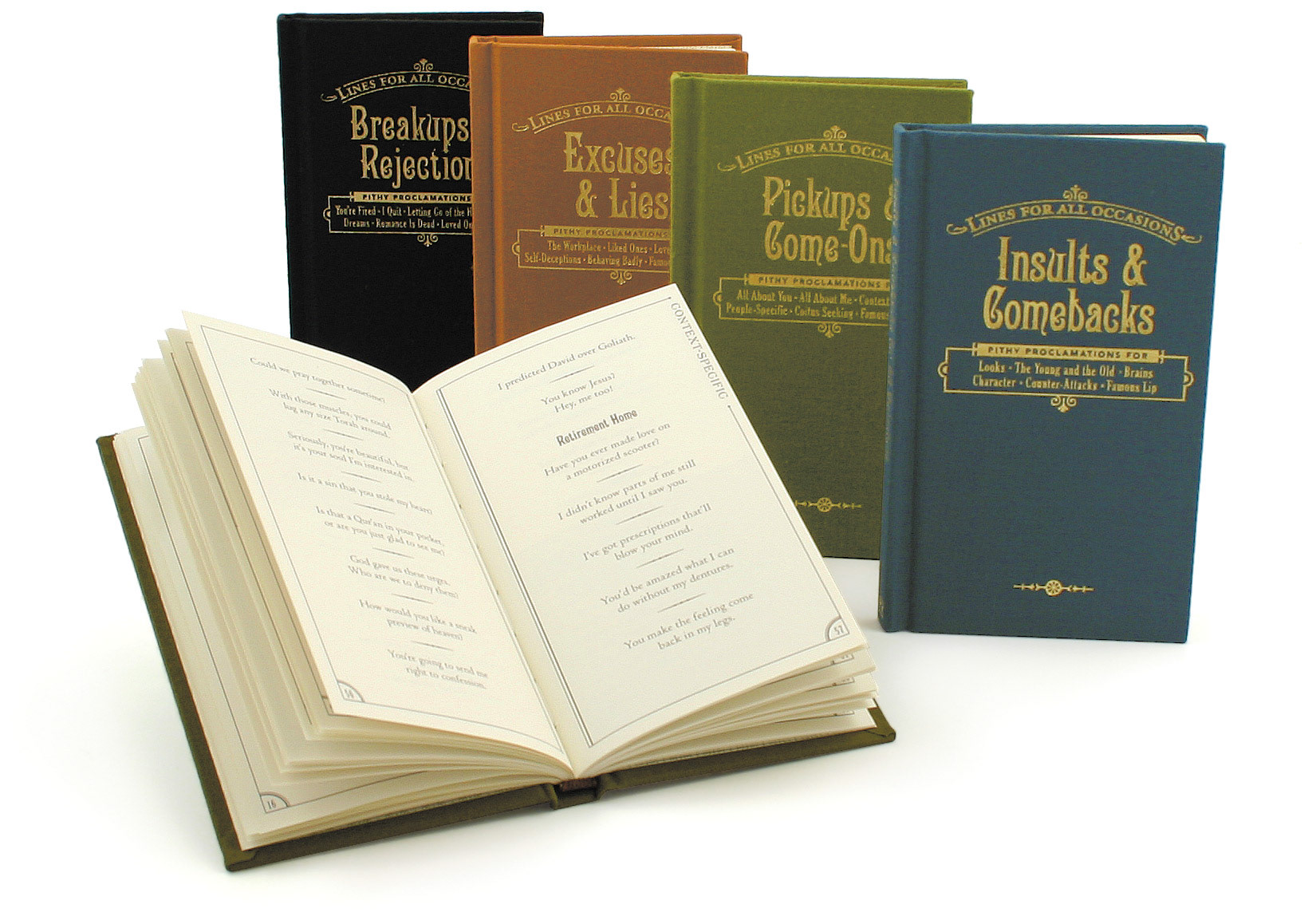
This product line was envisioned to be a set of pocket-sized gift books filled with snarky one-liners specially selected for an assortment of difficult situations.
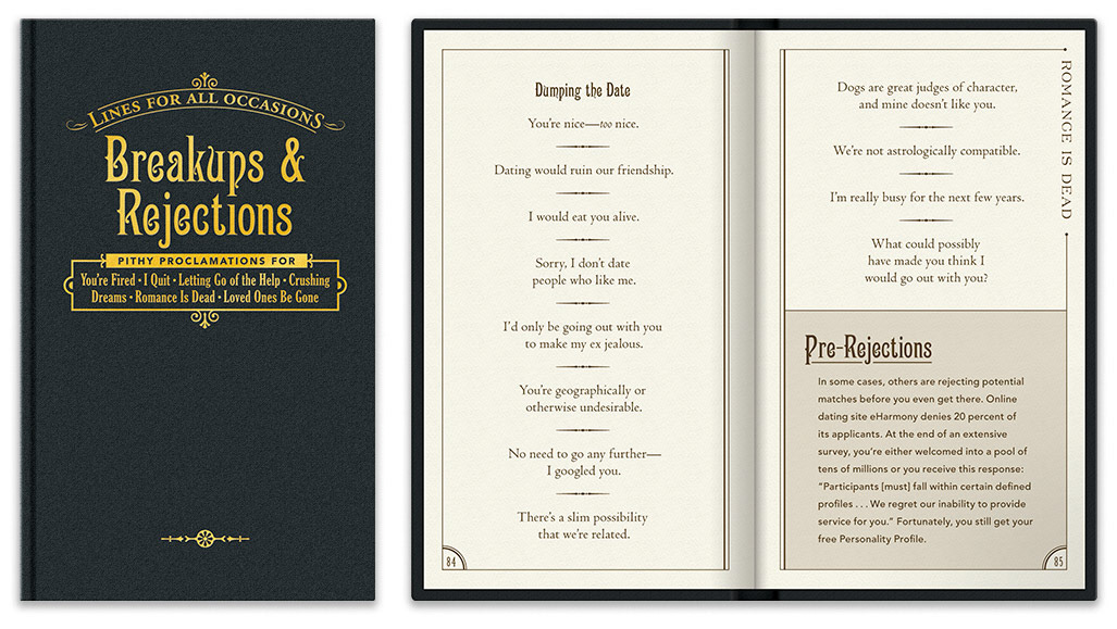
We quickly landed on the notion that juxtaposing this kind of irreverent content with a pastiche of a Victorian social etiquette guide would provide a nice dose of visual irony. To this end, these diminutive hardcovers would boast fabric-wrapped covers and foil-stamped typography.
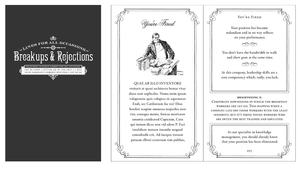
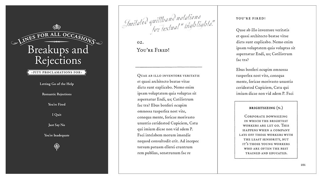
Below are some initial designs created in the earlier phases. One of the limitations was that doing a foil stamp on a fabric cover limited the amount of fine typographic detail possible on the cover. Accordingly, the final cover typography is a bit of a blend of two earlier variants shown below.
These earlier versions also show different page designs for title sand sample pages, showing approaches for how the primary content can be periodically interrupted by sidebar supplements. That sample on the right had an additional treatment to incorporate marginalia, as if written by a previous owner of the book from ages past.