

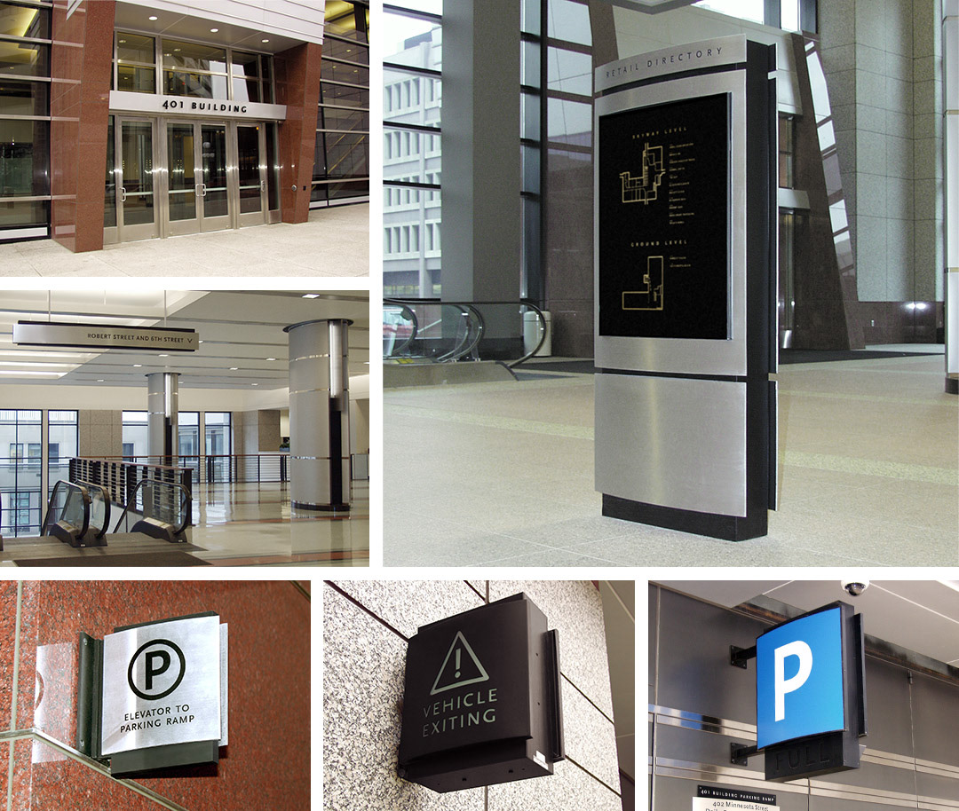
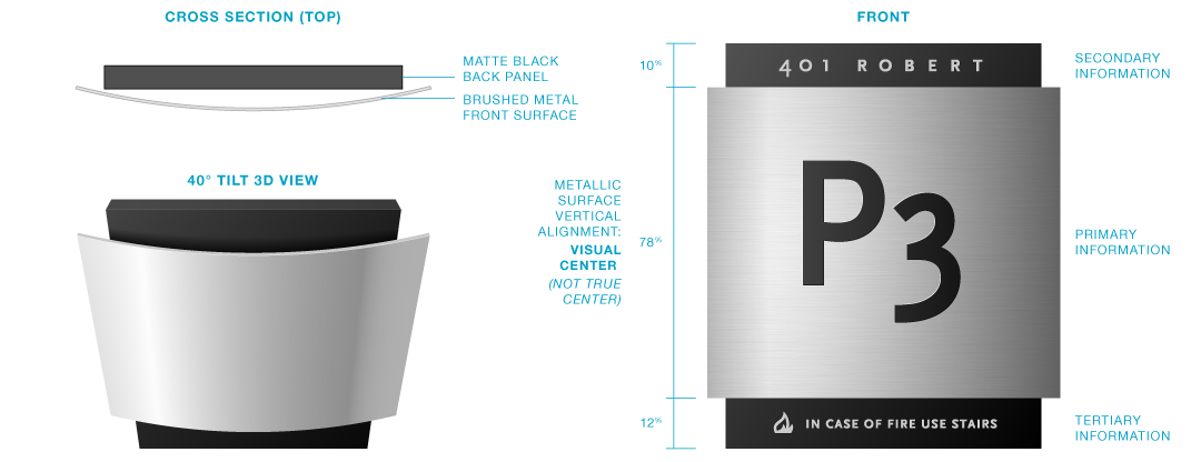
Design
These signs are instances of a sign and wayfinding system for a building in downtown Saint Paul. In an effort to make the sign system feel like an extension of the existing architectural themes, I drew inspiration from the decorative column treatment. The resulting theme combined a curved brushed aluminum face that caught the ambient light mounted to a flat black monolithic slab to provide contrast.
And then came…
Larsen Design Office Nameplates
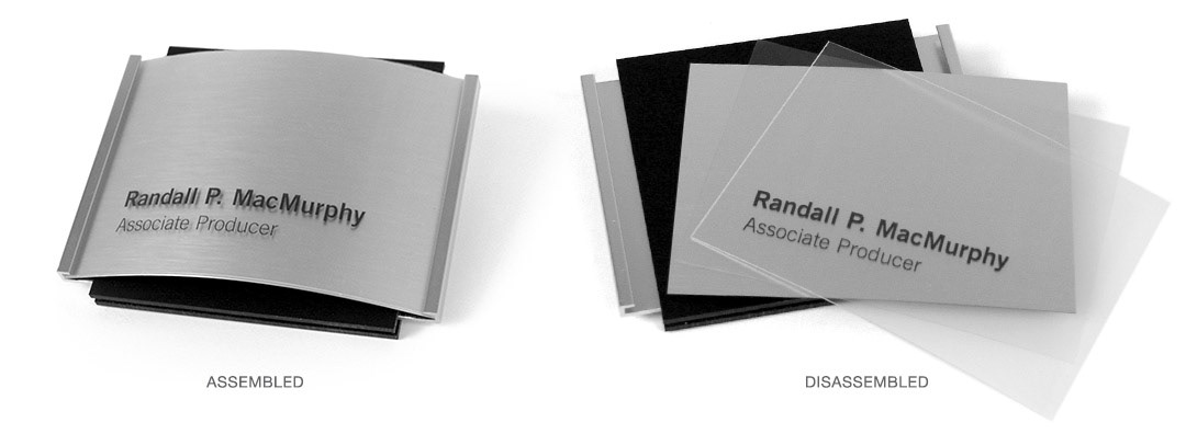
After that project was produced, I got a visit from the boss of my design agency asking me to adapt the design for employee nameplates for our agency — which was flattering.
But how to adapt permanent signage into a system that could be easily swapped out for new employees and name changes while still maintaining that metallic look? I dreamed up a method for sandwiching a metallic laminate, transparency that can go through a laser printer and a protective plastic front piece. While I would never bill myself as a sign engineer, my ad-hoc solution did the trick!
