Featured in AIGA's 365 Annual Design Exhibition 2009
Design, illustration, production
Old-School Bingo is a gift product that grew out of a pre-existing activity to keep kids occupied when traveling. The concept was updated for grown-ups in increasingly irreverent iterations.
The first part of the process was to zero in on the design aesthetic via a style board. Of the various approaches presented, the "Vintage" approach was selected.
While the Roadtrip and Airplane iterations largely used pre-existing icon art, successive line extensions required new, custom-illustrated icons that felt familial to the existing icons yet introduced an irreverent sensibility while maintaining an iconic clarity.
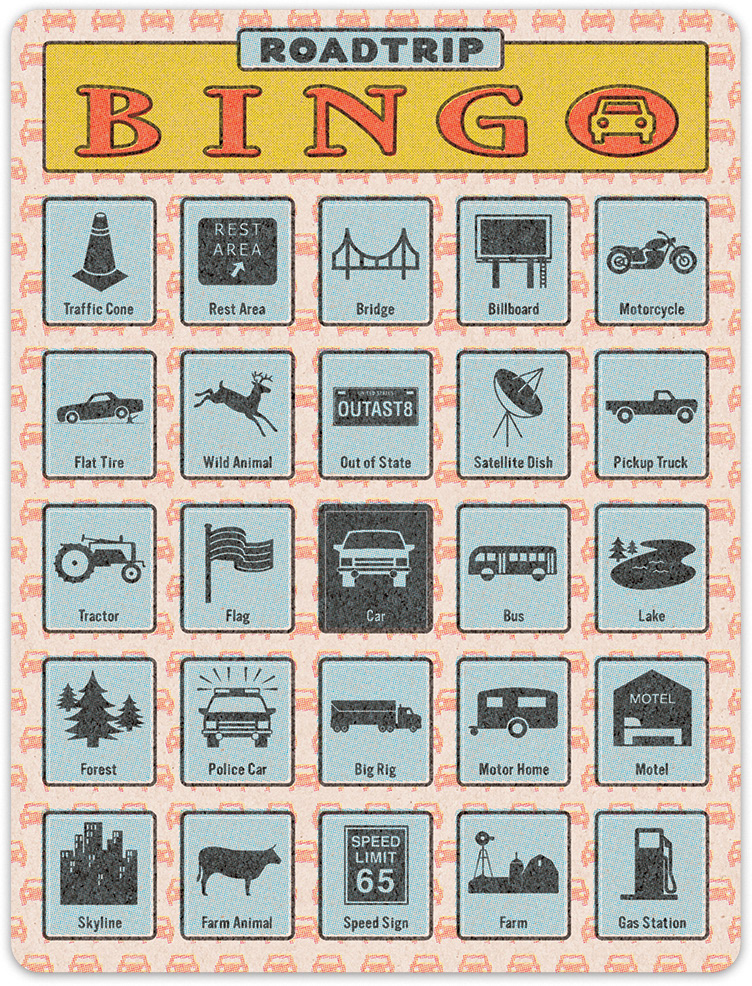
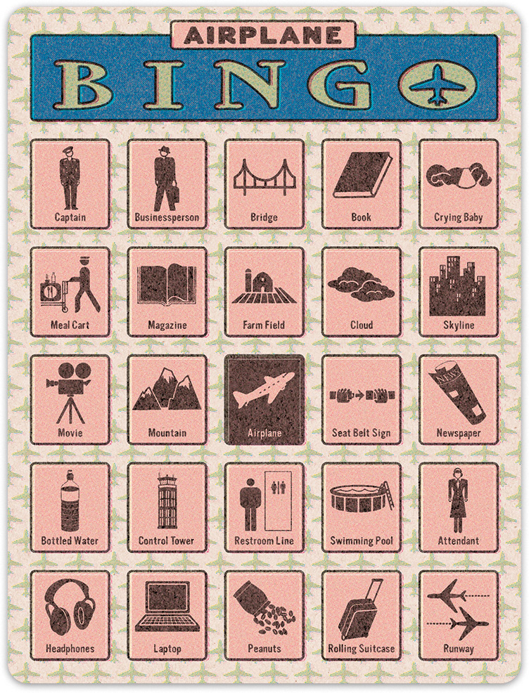
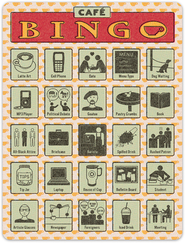
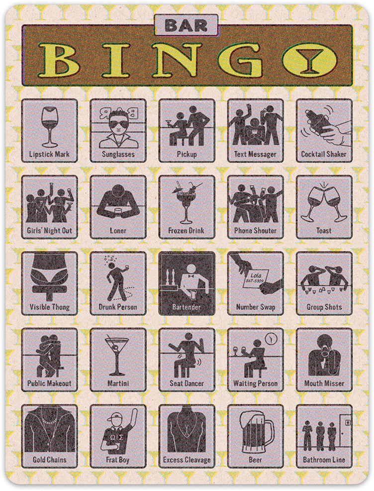
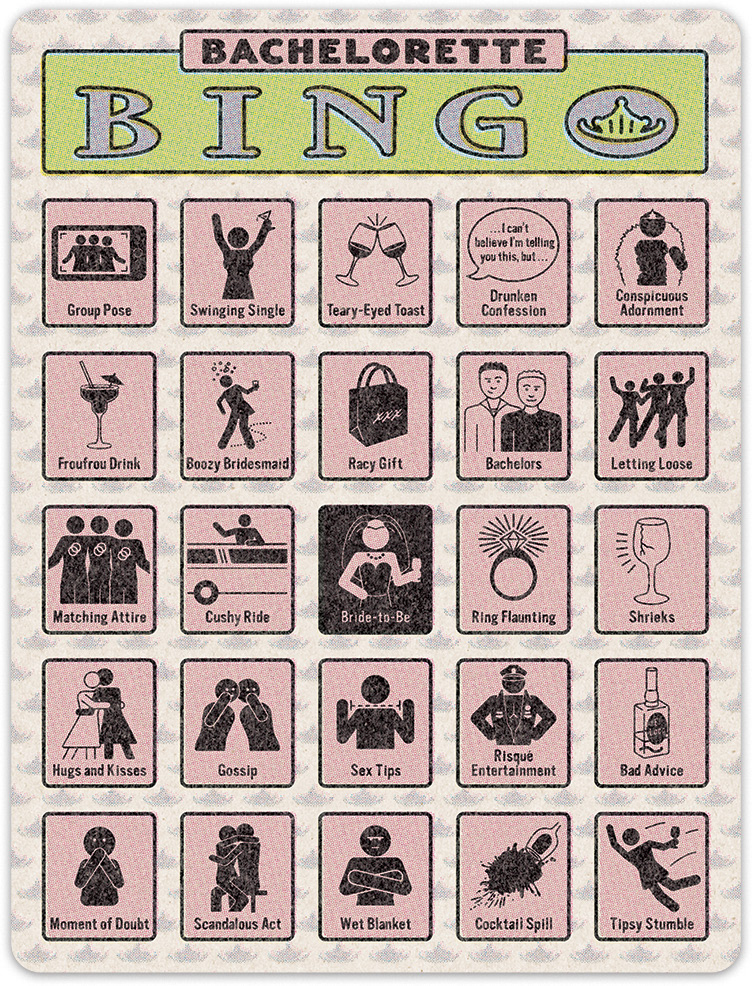
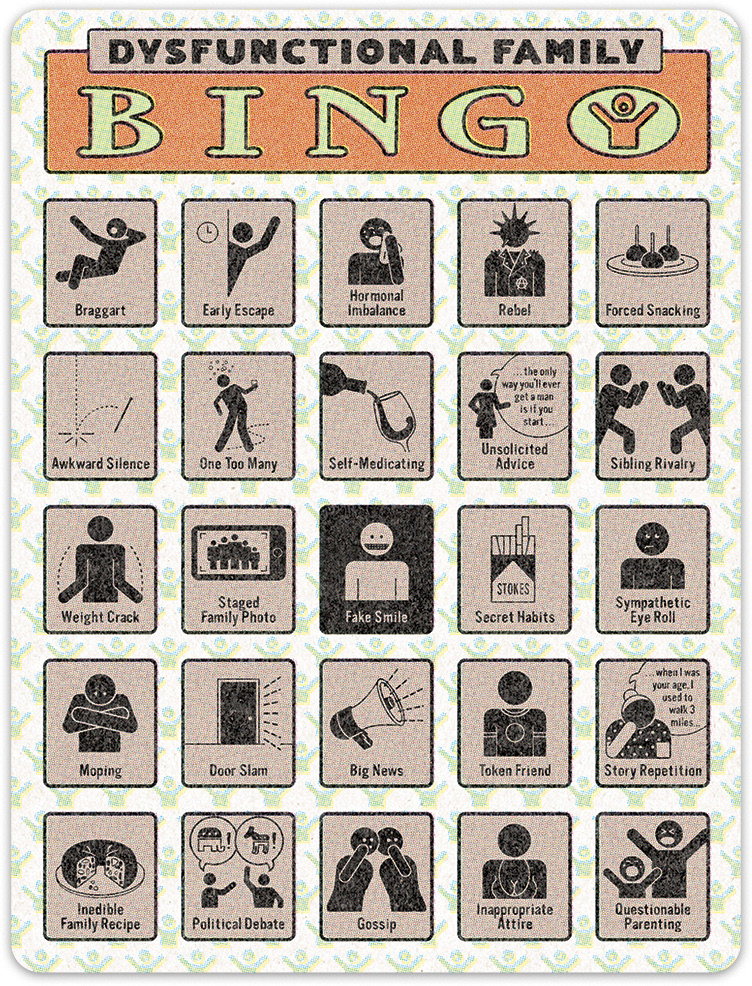
In addition to randomizing the icon positions for each card in a pack, there was an additional technical challenge in replicating the imperfections of vintage printed material. While Photoshop users are familiar with the Color Halftone filter, that simplistic approach has the disadvantage of converting 100% black line art into a halftone as well, which not only falls short of a faithful recreation of the effect, but also reduces the legibility of the 12 pt. icon label typography. Moreover, we had to create 24 variants of each card with the icons in different positions to make gameplay possible.
The solution I devised solved both issues…
If you don't care about technical production art process talk, you're probably going to want to skip this next section and just click on through to the next project. I include it to demonstrate the pride I take in solving problems of technical nature as much as creative and visual ones.
I realized that the first order was to keep the 100% black line art on its own layer in Illustrator, separate from CMYK color used to create the color fills.
The color fill art was brought into Photoshop where I could convert each CMYK channel to a line screen independently. Moreover, each dot pattern was put through a Roughen filter to simulate the dot gain on low-quality paper. Each CMYK channel was manually offset a bit to simulate "plate drift" on a cheap press. This color halftone art was placed into an InDesign master page, ready to be reunited with the the black line art.
The black line art was first duplicated and its icons were rearranged for 24 variants with the aid of a random number generator. As all the art and typography was at 100%, I was able to run each variant through a multi-step process (automated via a Photoshop action) to achieve a roughened, imperfect imprint effect. As an added bonus, these numerous one-color variants could be saved as a Grayscale files, yielding smaller file sizes than RGB or CMYK files would have been.
Each of these "black plate" variants were added on separate InDesign pages via the Multiply mode, finally reuniting with the color halftone art on the master page.
*whew.*
