

Featured in Communication Arts' Design Annual 2010 and HOW's International Design Annual 2011
Design, and a little bit of illustration and writing
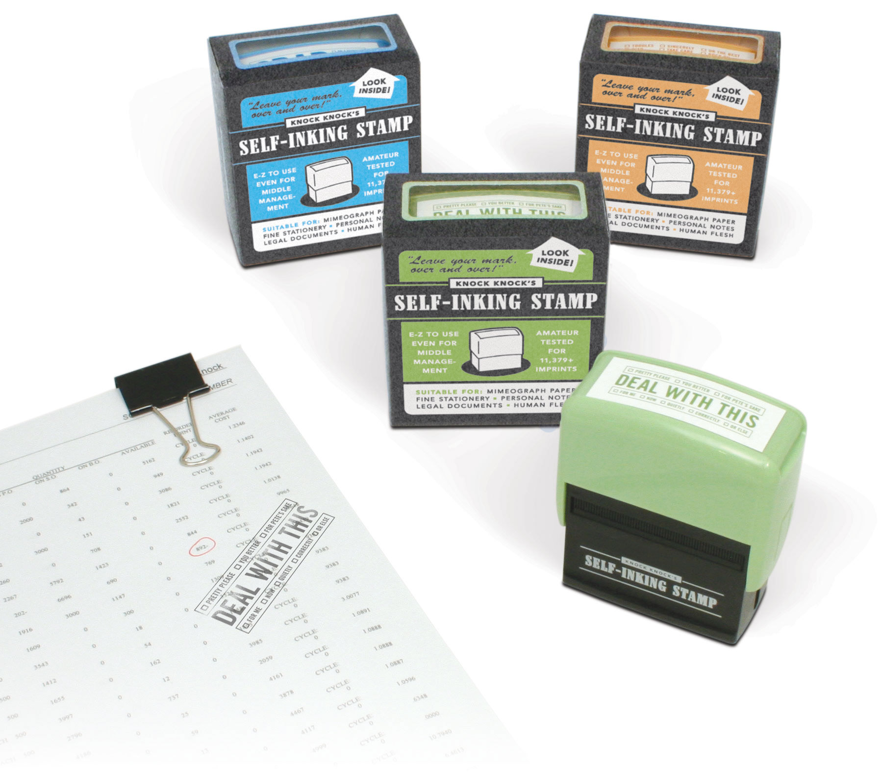
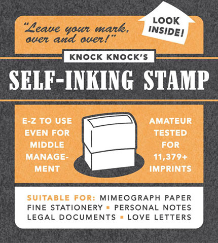
This was a fun little package design for a series of self-inking stamps with irreverent messages.
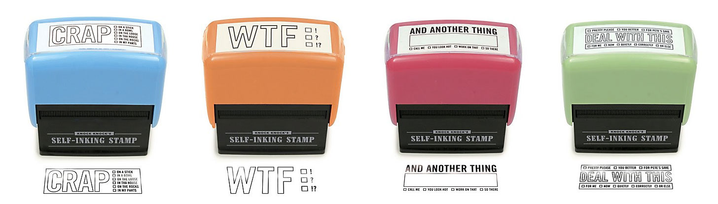
Beyond the graphic design crafted to evoke a 1940s aesthetic, this was a particular fun project for me because much of the tongue-in-cheek placeholder content made its way to the final piece, including the 2-step "no-duh" instructions for use and a great deal of tongue-in-cheek placeholder copy I wrote.

And on top of the design awards, it presumably made an impression on Jennifer Aniston (at least according to the our company's PR and marketing department).
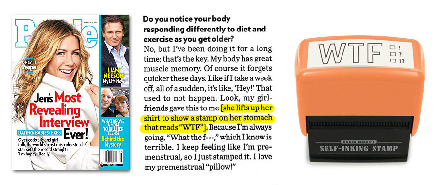
Bizarre? Without a doubt. But a little weirdness can bring a welcome spice to life.